MAISON — Editorial Journal
A concept editorial website for a fictional luxury clothing house, presenting collections through a magazine-style journal rather than a conventional e-commerce grid.
UX/UI Design
Concept
2024
Role
Web Designer
Duration
4 weeks
Team
Independent project
Tools
Figma, Framer
Status
Concept
View live website
View Process
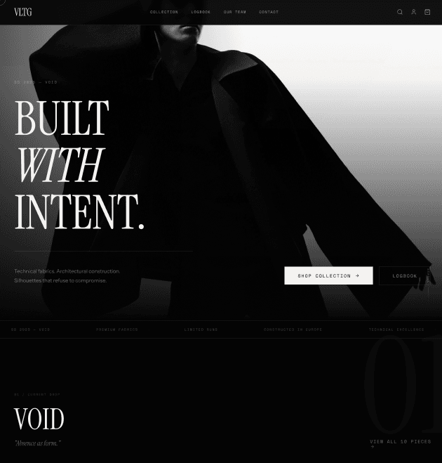
Overview
MAISON is a concept luxury clothing brand presented through an editorial-first website, treating each collection as a running journal of stories, imagery, and craftsmanship rather than a product catalogue.
Most luxury fashion sites default to dense product grids that flatten the storytelling the brand relies on in print and runway contexts. The challenge was to keep that editorial voice online.
The Problem
Luxury shoppers researching a collection online are usually met with grid layouts optimised for browsing quantity, which undersells craftsmanship, material, and narrative — the actual reasons they’re paying a premium.
Research
I studied leading fashion editorial sites and magazines to understand pacing, typography hierarchy, and how imagery-to-text ratio shifts reader attention through a story.
Research synthesis visual.

Key Insights
Full-bleed imagery paired with restrained, oversized typography created the strongest sense of craft and pace
Design Challenge
How might we let a shopper browse a full collection while feeling like they’re reading a magazine feature rather than scrolling a catalogue?
Ideation
I explored a straightforward product grid, a pure editorial scroll with no purchase path, and a hybrid — landing on the hybrid so shopping never breaks the storytelling.
Early concept exploration.
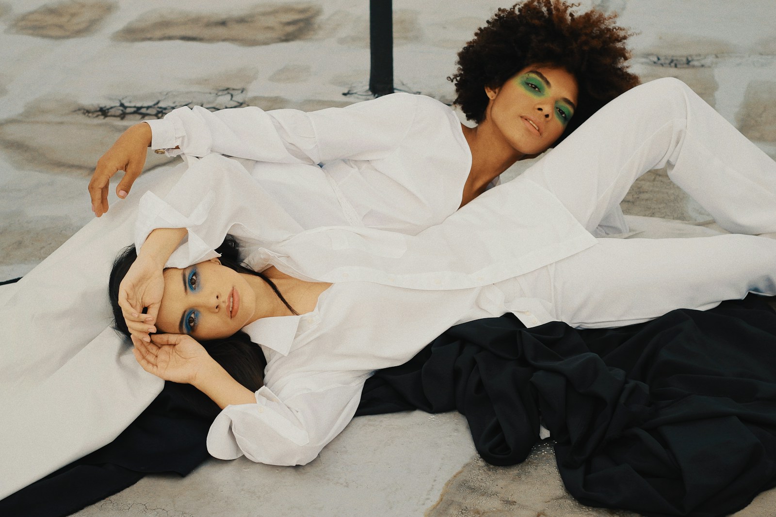
Information Architecture
The site is organised as journal ‘issues’, each covering one collection with a lead feature, look-by-look spreads, and a subtle shop link woven into each look rather than a separate store section.
User Flows
Readers land on the latest issue, scroll through a long-form feature with embedded looks, and can expand any look into details and sizing without leaving the editorial flow.
Wireframes
Wireframes explored where to place shopping actions inside a long-form layout. A small persistent tag on each image tested better than a sidebar cart that competed with the imagery.
UI Design
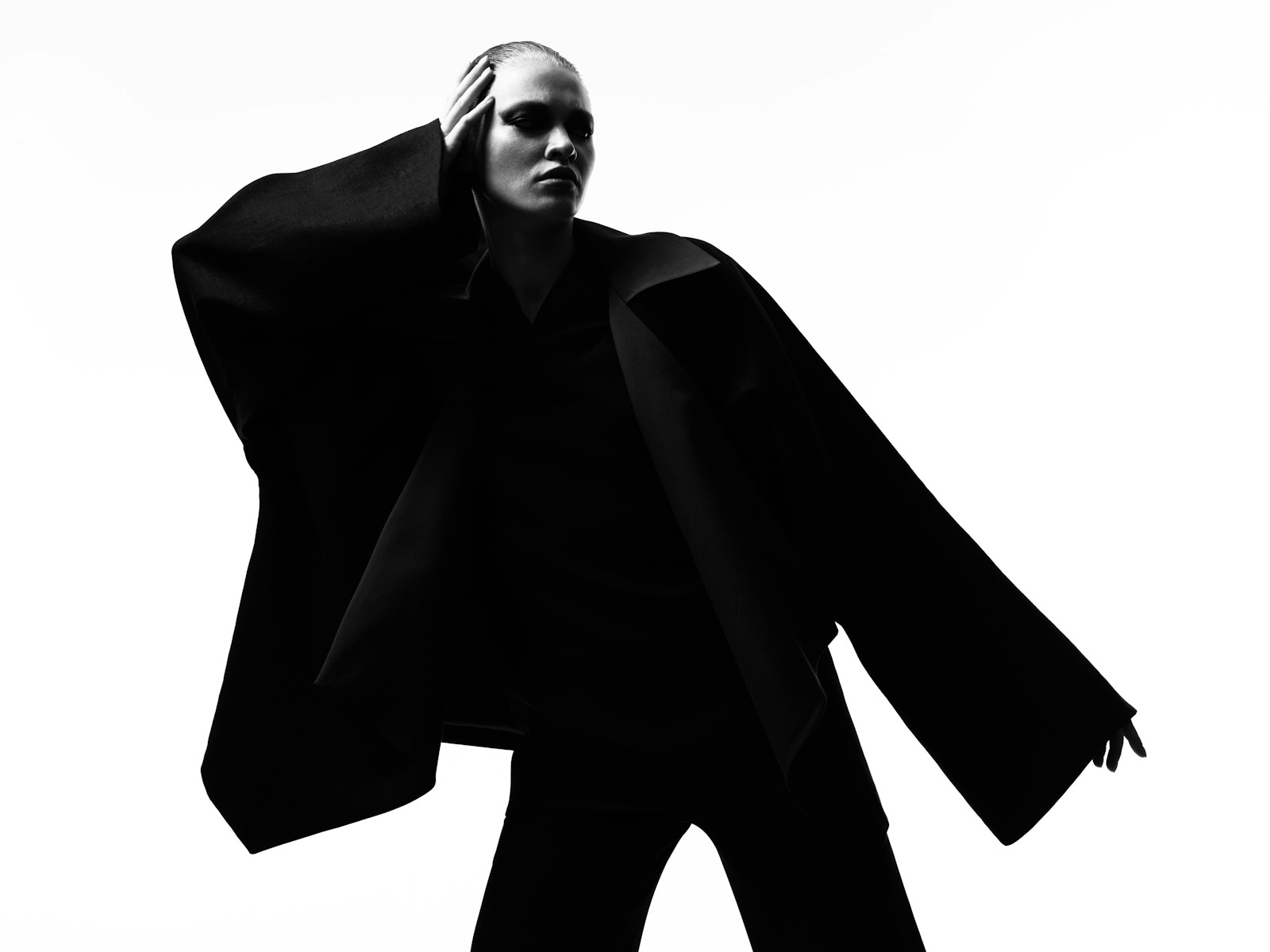
The UI pairs a serif display face for headlines with a clean sans body face, generous negative space, and large duotone imagery to keep the visual language closer to print than commerce.
Final interface detail.
Prototype
The prototype demonstrates scrolling through an issue, expanding a look for details, and moving between issues via a minimal archive index.
Testing
As a concept project this hasn’t been tested with real shoppers. Validating whether embedded shop tags convert as well as a traditional store would be a useful next step.
Iteration
Navigation moved from a fixed sidebar index to a slim top bar after testing showed the sidebar competed for attention with the full-bleed imagery.
Final Solution
The final design is a magazine-style journal where each collection is a long-form issue, with shopping woven subtly into the editorial rather than pulled into a separate store.
Final concept screens.
Outcome
As a concept project for a fictional brand, this hasn’t been launched. It explores how luxury fashion brands could better carry their print voice onto the web.
Reflection
This project sharpened my instinct for pacing long-form pages. Next I’d test how far editorial storytelling can go before shoppers want a faster, grid-based alternative.
More Work

UX/UI Design
A portfolio preview for an ethical tourism platform that helps people understand conservation-first travel choices.

UX/UI Design
A concept mobile experience imagining a co-branded Audi F1 x Revolut card, letting Revolut users design and manage a motorsport-inspired card inside the app.

UX/UI Design
A concept interface letting Audemars Piguet clients configure their own Royal Oak — case finish, dial, strap, and engraving — before reserving it with a boutique.
Have a project or opportunity in mind?
Let’s talk →
DillonB
Turning complex problems into clear digital experiences.
© 2026 Dillon Borkhatria. All rights reserved.
Designed & built by Dillon